Reimagining content discovery for Investor
UX Research · UX Design · Desktop · Mobile
What is Smartkarma?
Smartkarma is a subscription-based FinTech platform for investment recommendations from highly qualified analysts. It also serves as a network which connects investors with analysts.
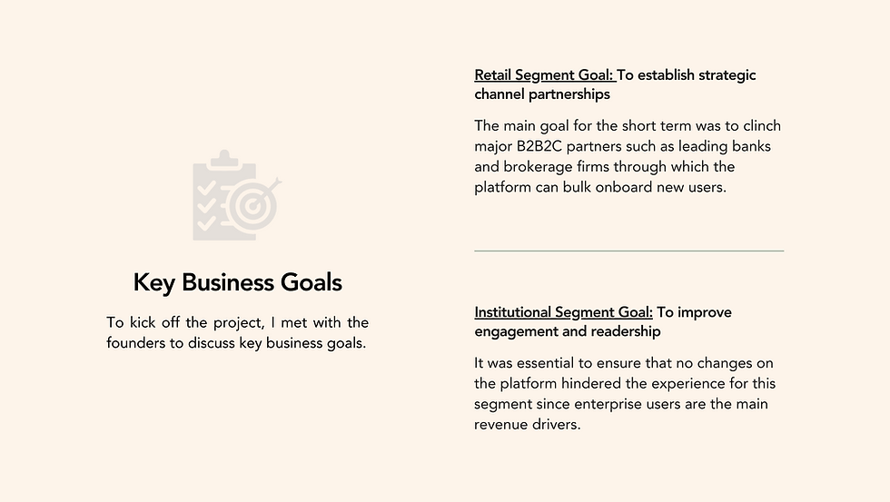
My Role
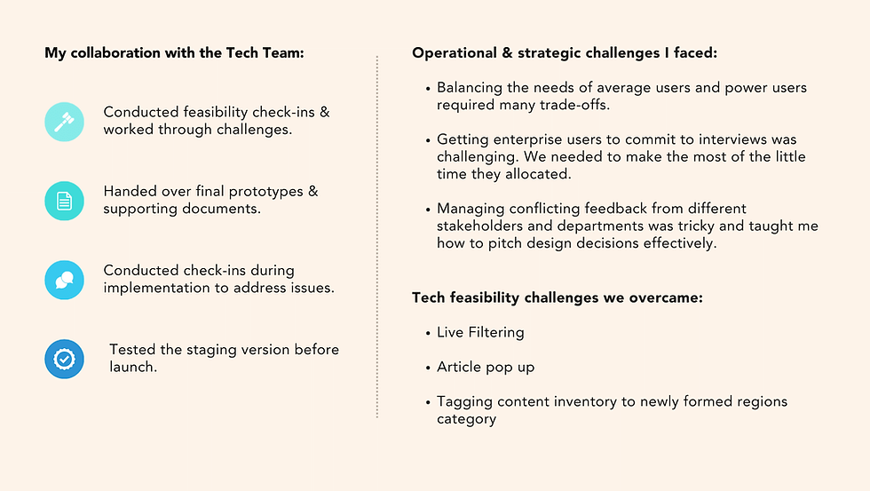
I was the sole UX Designer on this project and managed the process from Research & scoping to tech handover. The project took approximately 5 months to complete.
Collaborations
I collaborated with the Design Manager who crafted the Design System, a UX Researcher who assisted with conducting a few interviews, the Head of Tech as well as the Data Analytics team.
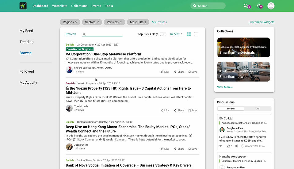
Before Project

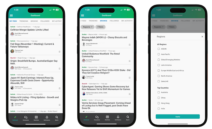
After Project


How Did We Reach Here?
Below is a deep dive into the stages & thought process that contributed to this redesign.

User Research
User Interviews
Purpose:
To understand users' motivations for using Smartkarma and uncover their pressing pain points.
User profiles interviewed:
-
3 institutional users who were active users of the platform (visit 2 to 3 times a month)
-
3 retail users who had been given early access and had been using the platform for 2 months
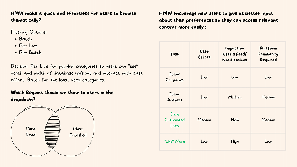
I synthesised the insights from the interviews into HMWs and User personas (shown below). This helped me define the problems and the user profiles I am designing for.

Persona 1: Derek the professional trader

Persona 2: Alice the retail trader

Platform Evaluation
Platform Audit
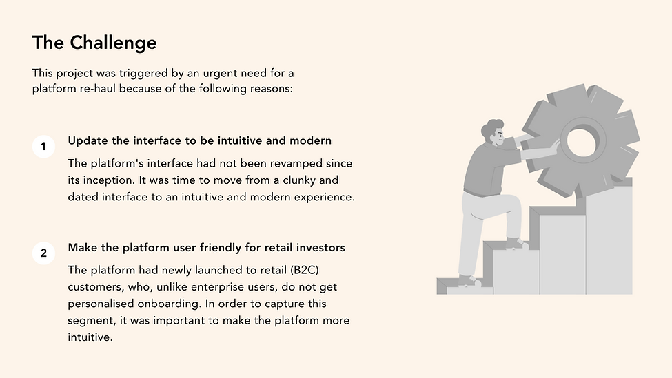
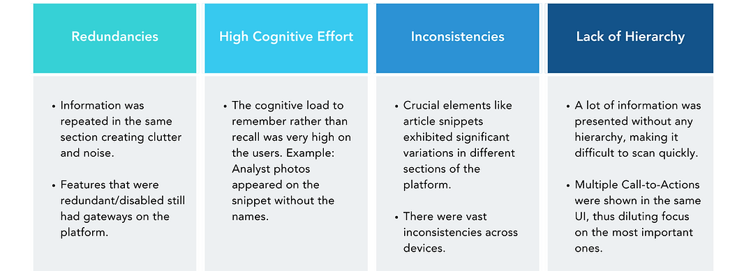
I conducted a UX Audit and Heuristic Evaluation of the platform (Desktop and Mobile). The following were the most pressing issues I discovered :
Landing and Insights Page Analysis
I analyzed analytics for engagement and identified drop-off points. I also accessed the platform through a new user account to simulate the average user's experience.


Ideation
A snippet of the brainstorming that contributed to the final solution.


Final Solution
Single Hero Landing Page: Allow Users to experience the main value proposition upfront and scan articles easily

Enable Users to easily explore the database
Enable users to easily navigate between articles
Allows users to easily revisit topics of interest

Enable Users to "like" easily
We placed likes in more contextual touch-points because:
-
Likes improve the recommendation engine, allowing the platform to show more relevant content in the user’s feed.
-
Users who "like" more have a higher no. of median insights read than users who do not.

Like CTA was added to the snippet
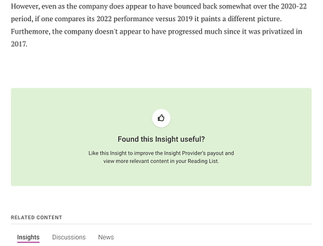
Like CTA was added at the end of the insight

We removed the manadatory follow-up question to make "liking" easier.
Concluding Notes
Next Steps
-
Having identified the platform's shortcomings in supporting browsing behaviour, we endeavoured to revamp the "Collections" section after completing this project.
-
Had I still been at the firm, my next step would've been to flesh out and improve the "Related Content" sections to enable users to continue their journey seamlessly once they have expressed interest in a topic by visiting an article/entity/analyst's page. I believe this is crucial to creating the "rabbit hole" experience by encouraging "cherry-picking" behaviour.