Creating a Reporting Tool for CFOs
UX Research · UX Design · Desktop
What is Bunker?
Bunker is a financial analytics SAAS platform designed for CFOs and finance professionals. It integrates seamlessly with popular accounting tools like Xero and QuickBooks to consolidate financial data and transform it into clear, actionable insights.
My Role
I was the sole UX Designer. I conducted and synthesized user research, partnered on project scoping and feature prioritization. I conducted competitive analysis, created mockups, facilitated user testing, and translated insights into iterations that improved the product experience.
Collaborations
I collaborated closely with the Head of Product to align on vision and priorities, partnered with engineers to conduct feasibility checks and ensure smooth implementation, and worked with the marketing specialist to maintain consistent messaging and positioning.
The Problem

Key User Insight: Financial Reporting is painful and often comes at the cost of deep strategic work.
Our target users, fractional CFOs and in-house finance teams, spent a substantial proportion of their working hours preparing periodic reports for clients, executives, boards, and investors. These recurring deliverables consistently drained time from higher-value work. The manual cycle of
export → validate → pivot → format created unnecessary operational drag, costing teams valuable investment in strategic analysis.
The Solution
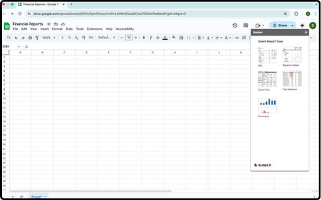
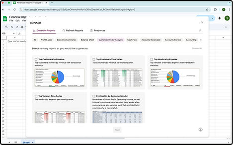
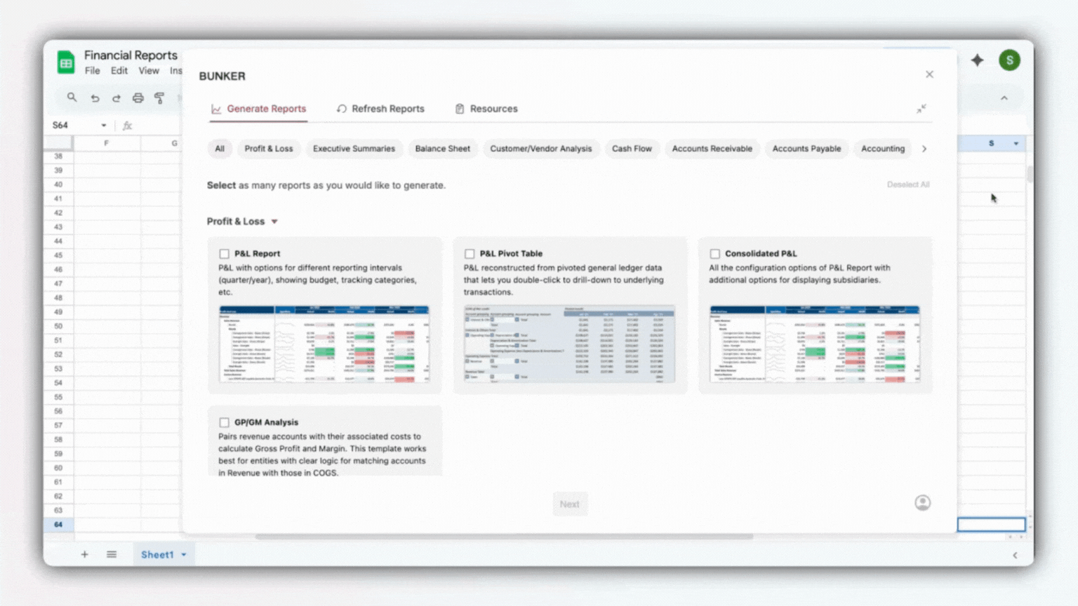
A Google Sheets extension that generates ready-to-use reports with data pre-filled directly from the client’s accounting software. Reports can be customized, shared, refreshed and exported with ease - reducing the manual burden of reporting while giving finance teams the flexibility to run custom analysis in a familiar environment.
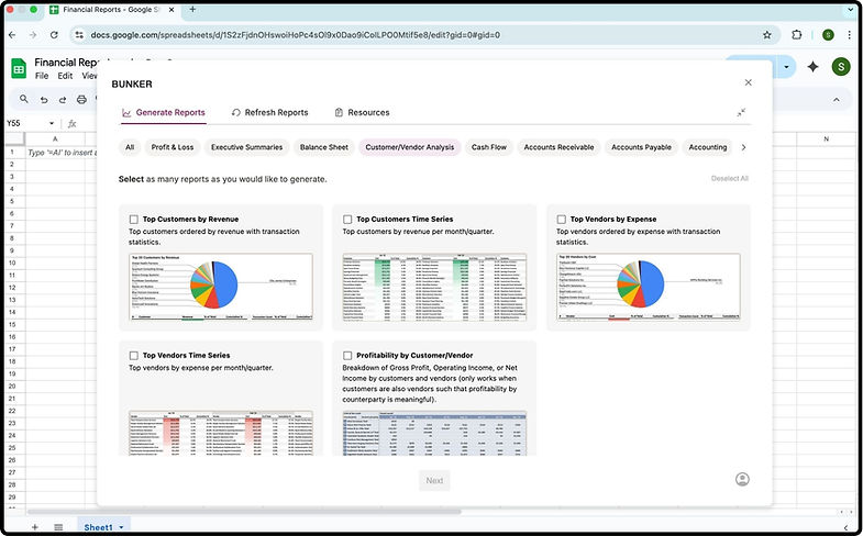
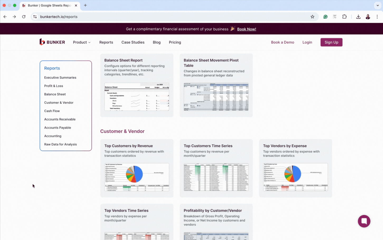
The landing page was designed to optimize for findability and scannability, while also showcasing the breadth of 27+ report templates. We ensured users had enough context to quickly assess relevance.

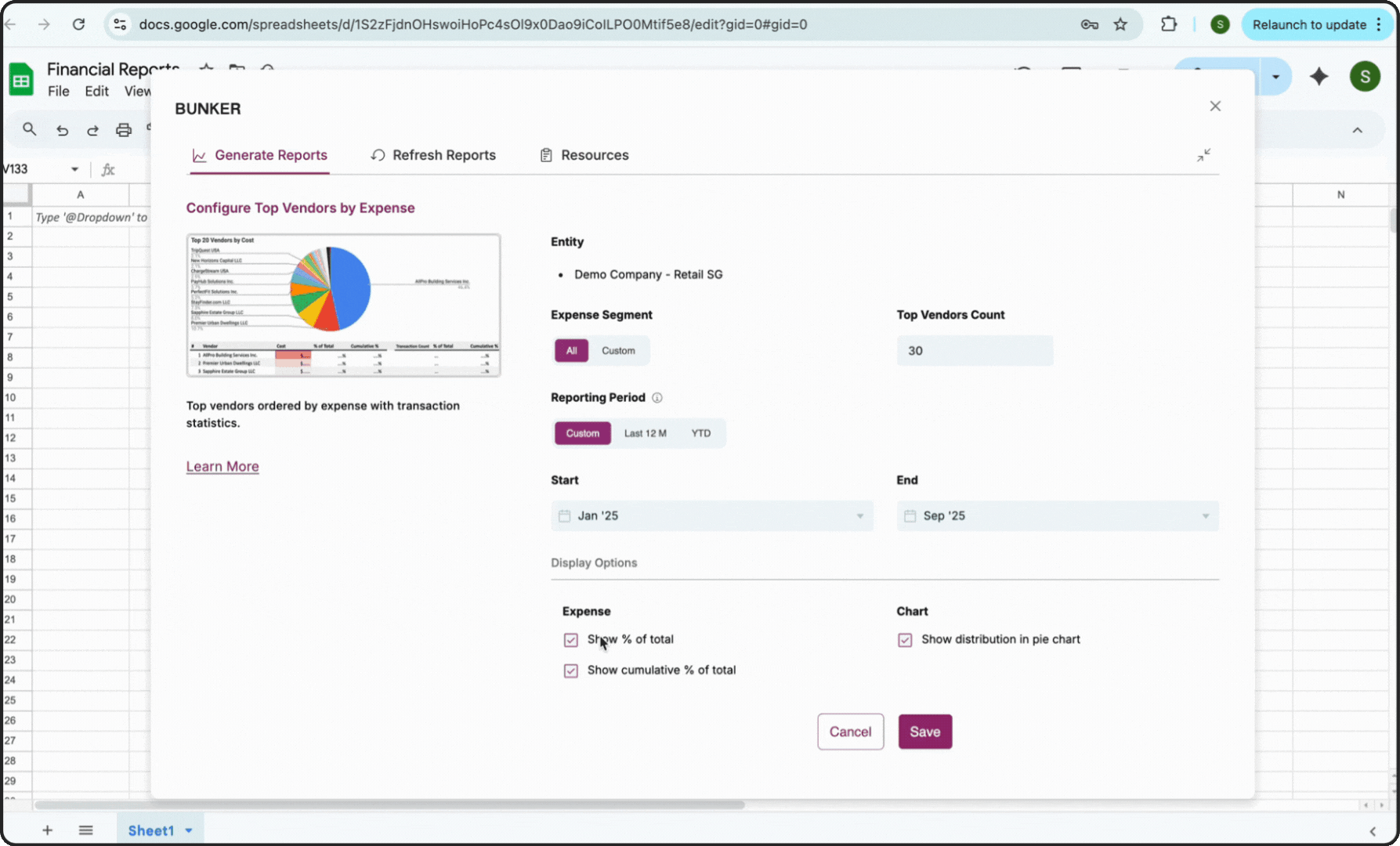
The report customizations were designed to balance flexibility with simplicity. We optimised for reduced cognitive load and quick, clear decision-making. Sensible defaults allowed users to generate reports instantly without customization.
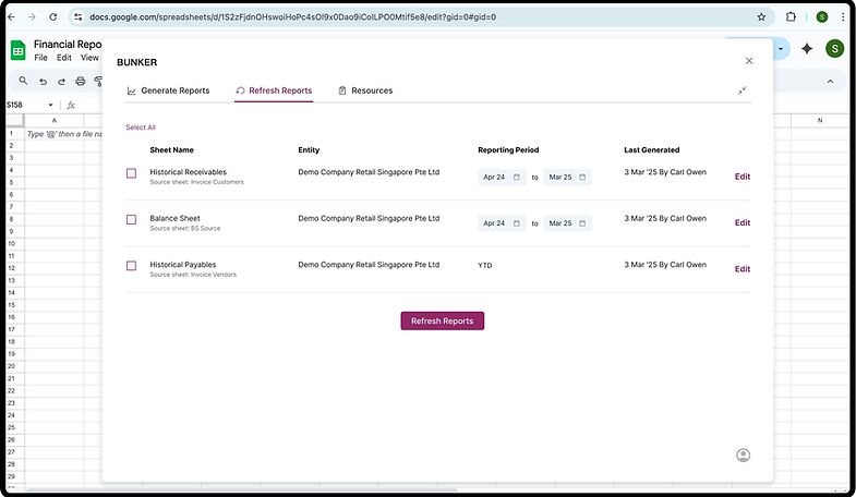
A key part of the value proposition was making reports easily refreshable. The refresh page let users update date ranges or other customizations with ease, ensuring reports stayed current without starting from scratch.
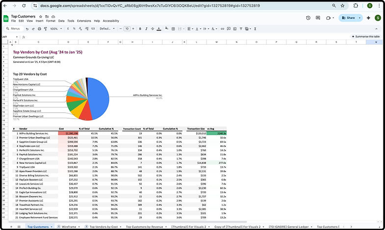
The final report was generated directly in Google Sheets, giving users a familiar environment to analyze, pivot, and share their data. The output was presented in a clean, professional format with charts, graphs, collapsible sections, and drill-down interactions where relevant.
How Did We Reach Here?
Below is a deep dive into the goals, challenges, analysis that contributed to this project.
Goals & Success Criteria
User Goals
-
Save effort by drastically reducing the time spent preparing recurring reports.
-
Support flexibility so CFOs and advisors could adapt reports to their unique goals and storytelling styles.
-
Build confidence by ensuring reports were reliable and refreshable without manual errors.
Business Goals
-
Strengthen the value proposition by positioning reporting as a differentiated feature during sales conversations.
-
Drive conversion by helping close deals with prospects evaluating Bunker.
Success Criteria
-
Users can generate reports within seconds (vs. hours).
-
Reports can be refreshed instantly without rebuilding.
-
Users can easily customise reports to it different needs (e.g. board, C-suite, investors).
-
Finance teams have high confidence in report accuracy and consistency.
-
Reporting becomes a visible selling point for Bunker in client demos and evaluations.
Product Challenges
📚 Scaling Template Discovery
We initially designed a compact side panel so users could view Sheets data while browsing report options. But as the library quickly scaled to 27+ templates, discovery became a major issue. The side panel format no longer worked. We redesigned the flow using a larger modal that supported search and browsing, ensuring the growing library remained usable.
⏳ Performance & Latency
Bulk report generation created latency that frustrated users. Engineering worked on reducing load times, while on the UX side, I designed a floating widget so users could keep working in Sheets while their reports generated. This reduced frustration and preserved continuity in their workflow. I also incorporated meta-data to show report generation progress.
🔌 Extension Download & Onboarding
The biggest barrier to adoption wasn’t using the extension — it was downloading it. Confusion around Gmail requirements, company IT policie, and an unclear installation flow created unnecessary friction. Once installed, users could generate reports in seconds, but reaching that point was the real challenge.
To ease this hurdle, we:
1. Created simple video tutorials and surfaced them at key touchpoints:
2. Proactively clarified common misconceptions in all product marketing material.
3. Equipped the sales team to anticipate and address these concerns directly during demo calls.
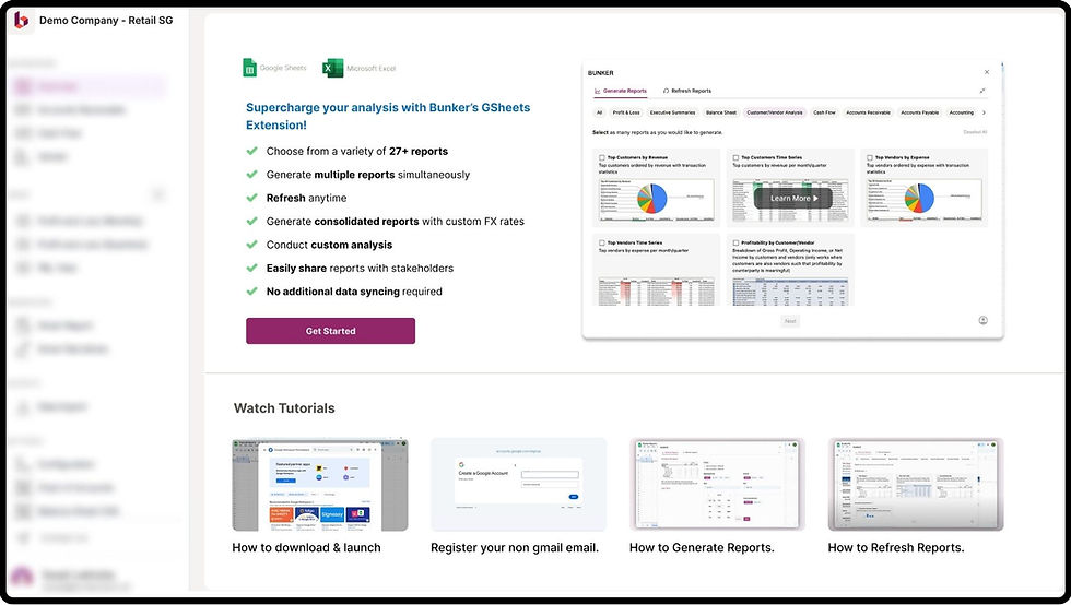
In-App information about the Google Sheets Extension along with links to useful tutorials.
Constraint
Time to market
The feature was strategically important for upcoming sales conversations, which meant we had to design and ship quickly, relying on bug bashes and focused user testing instead of longer cycles.
Next Steps
Looking ahead, I aim to:
-
Collect structured feedback on templates: Actively test different report templates and use user input to refine the formats that resonate most with CFOs, bookkeepers, and finance teams.
-
Enable custom template creation: Give users the ability to design and save their own report templates, so the tool adapts to their workflows instead of the other way around.
-
Integrate AI-driven customization: Explore AI to assist in creating templates quickly, as well as generate Bunker-authored summaries — turning complex financial data into concise, actionable narratives.